
Student Revamp Portal
This project focused on improving the usability and structure of a student portal by simplifying complex workflows, clarifying navigation, and creating a scalable interface for both students and administrators.
Industry:
Education
Agency:
Saylani
Time Period:
2 Months
Before designing solutions, I analyzed how students interacted with the platform to understand where friction occurred. Several workflows required unnecessary steps, navigation lacked clarity, and important information was difficult to find. The redesign focused on restructuring the experience so users could navigate faster and complete tasks with greater confidence.
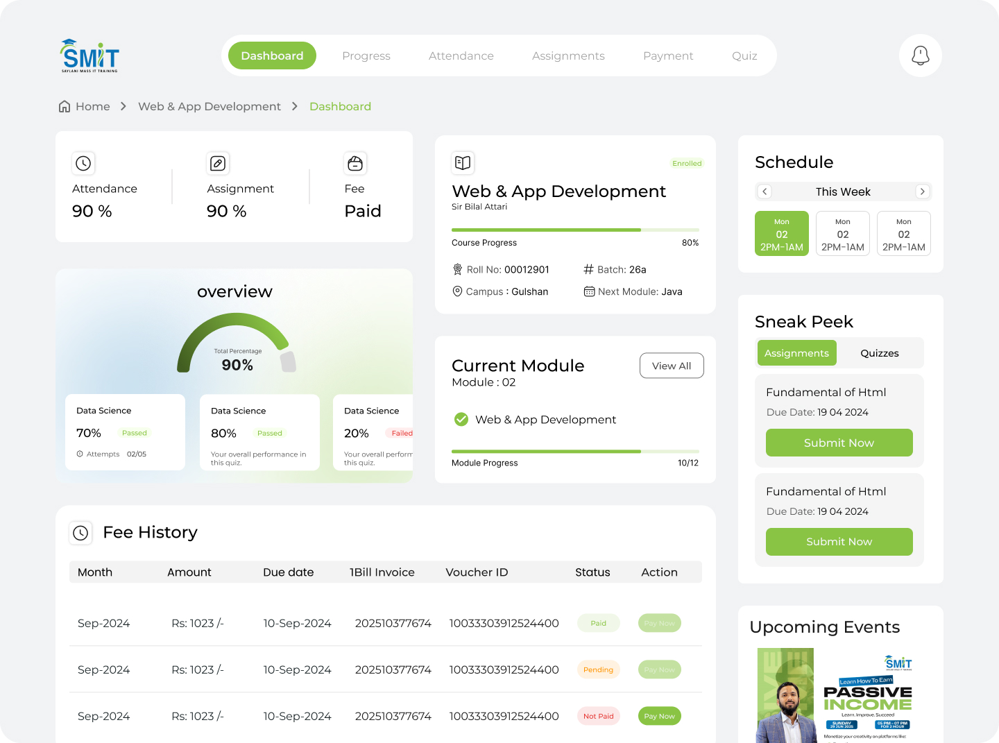
Users struggled to navigate the platform efficiently due to unclear information hierarchy and scattered functionality. Many essential tasks required multiple steps, and important sections were difficult to locate. This resulted in slower task completion, confusion for new users, and an overall experience that felt more complicated than necessary.
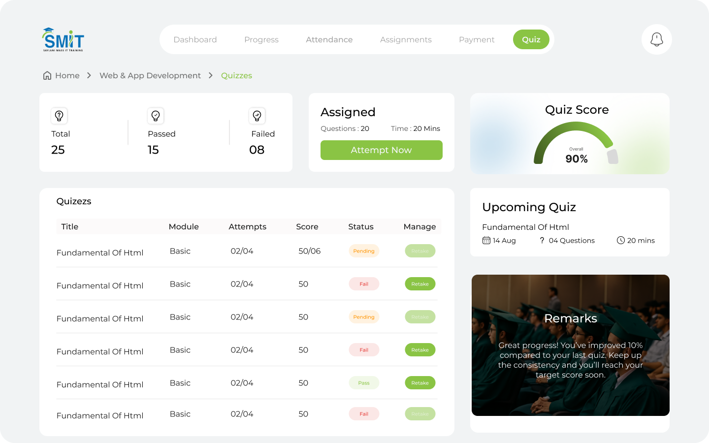
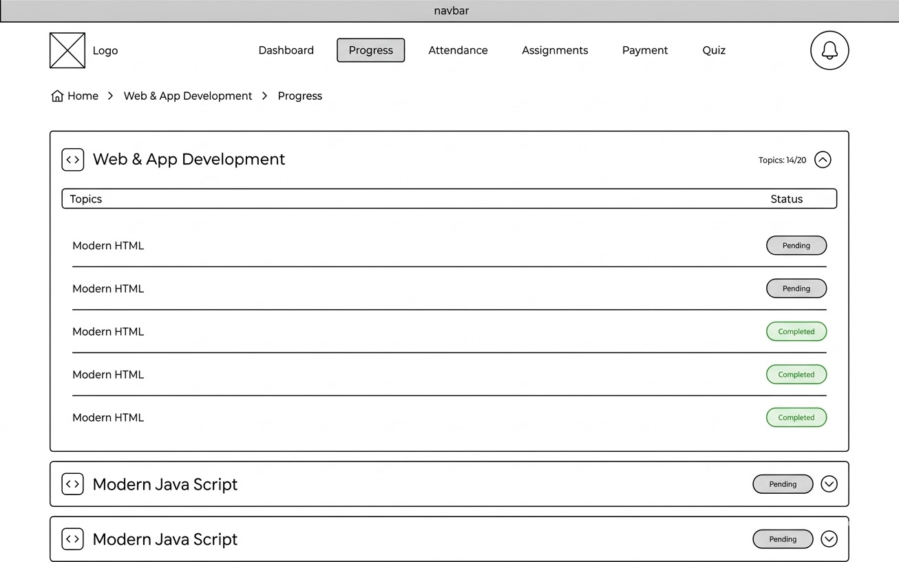
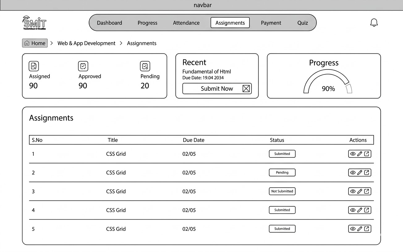
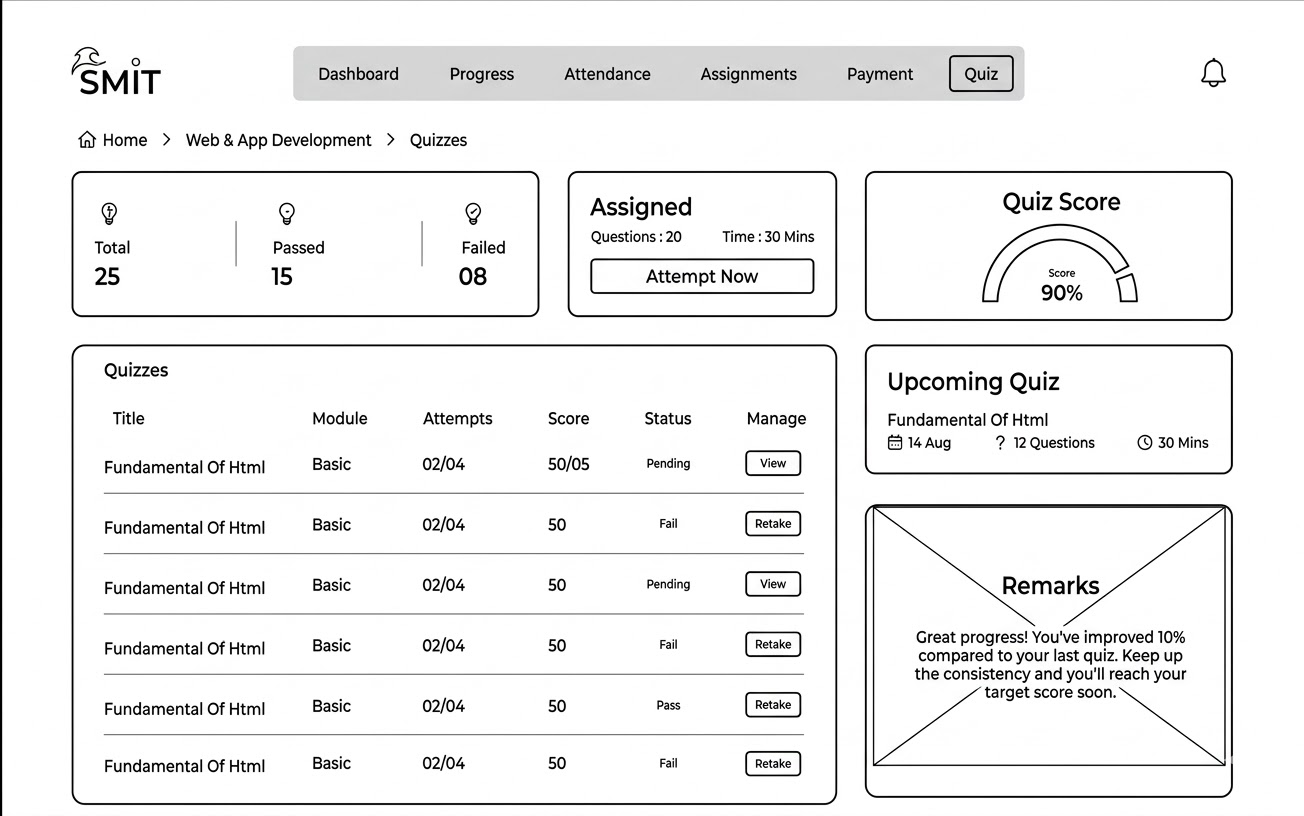
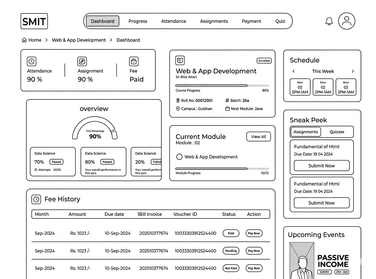
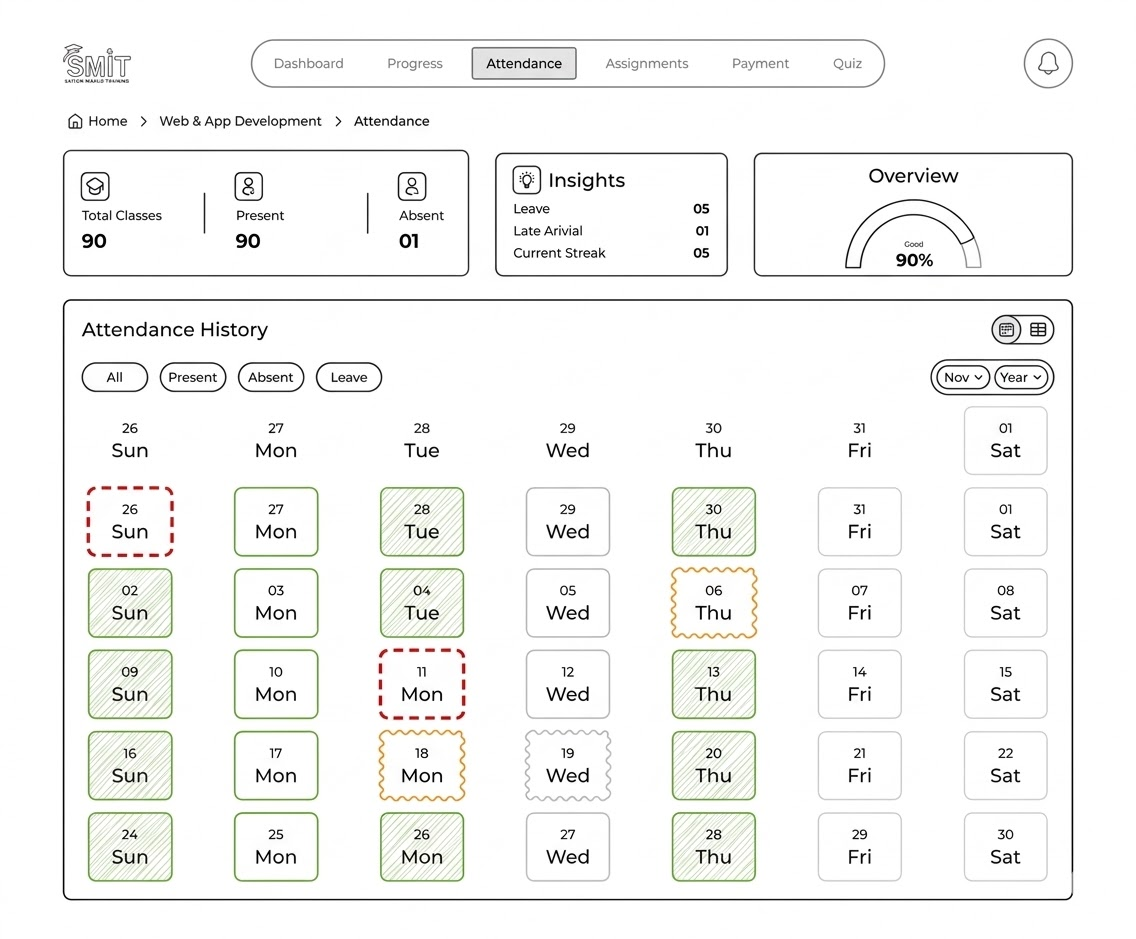
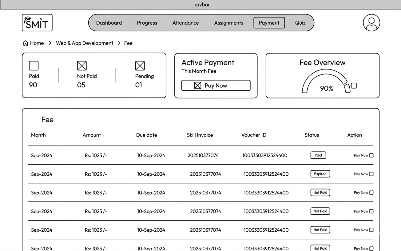
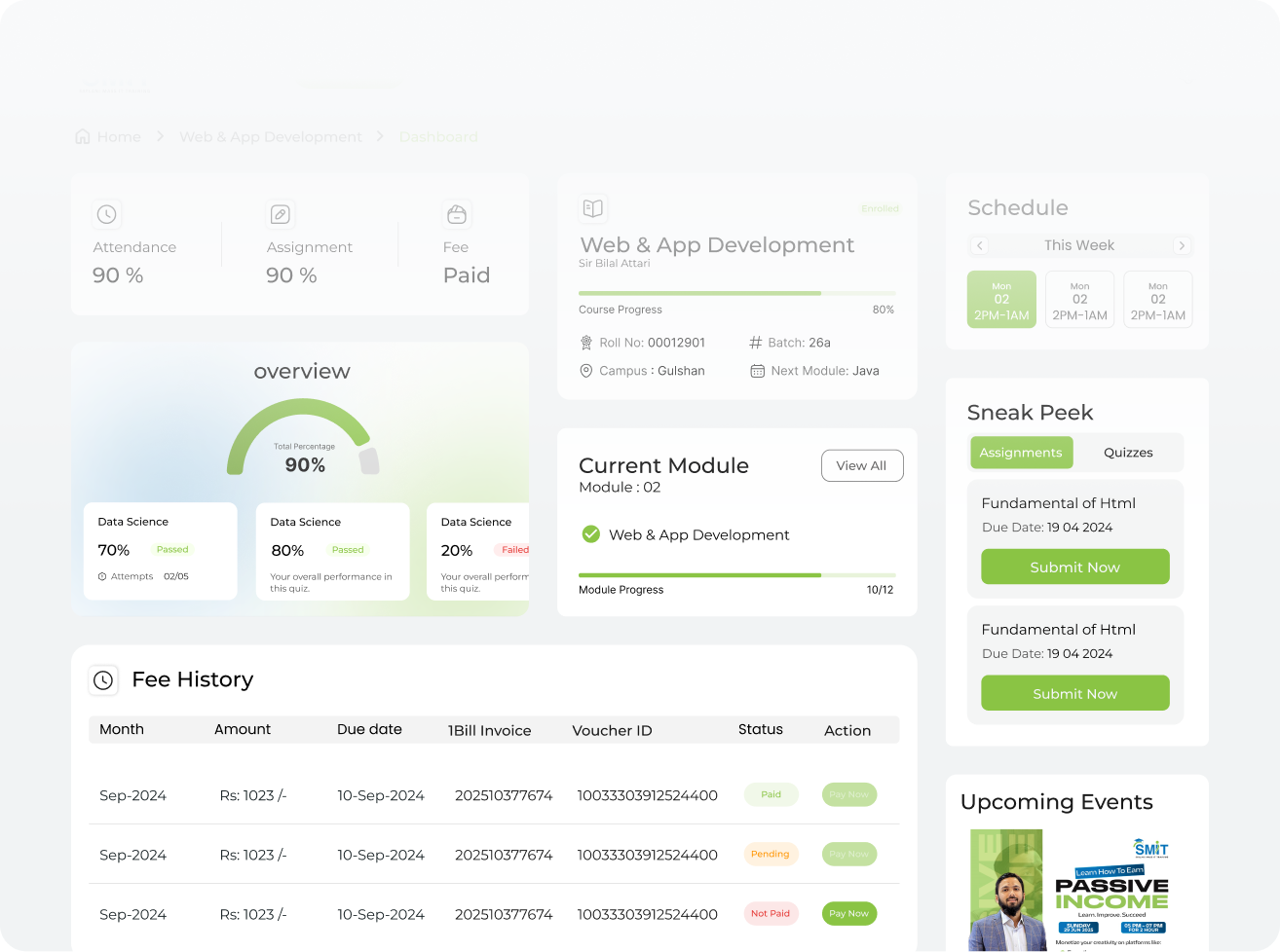
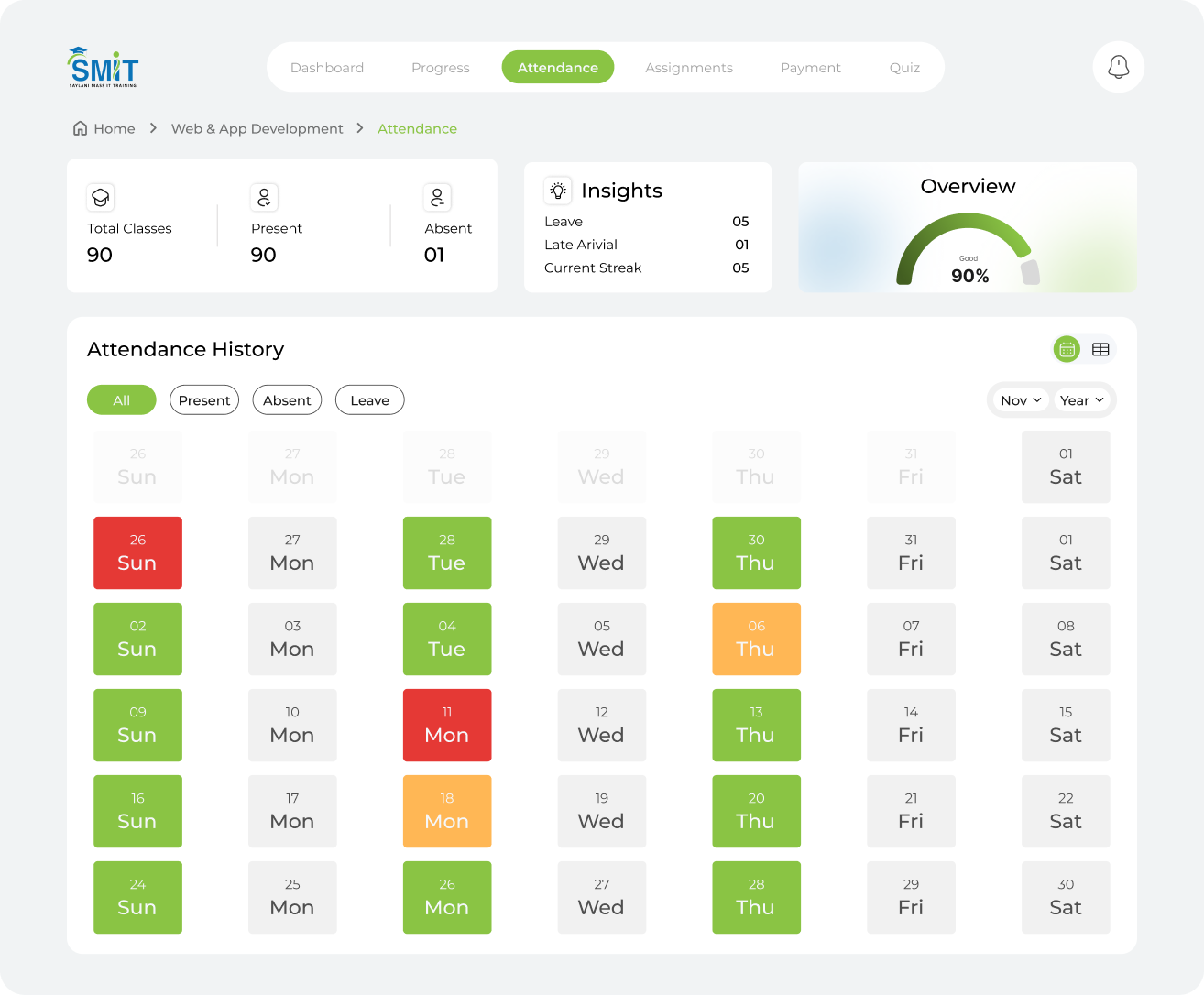
The solution focused on simplifying navigation, restructuring key workflows, and introducing a clearer interface hierarchy. By reorganizing the platform structure and improving interaction patterns, the redesigned experience allowed users to complete tasks faster while reducing confusion across the system.
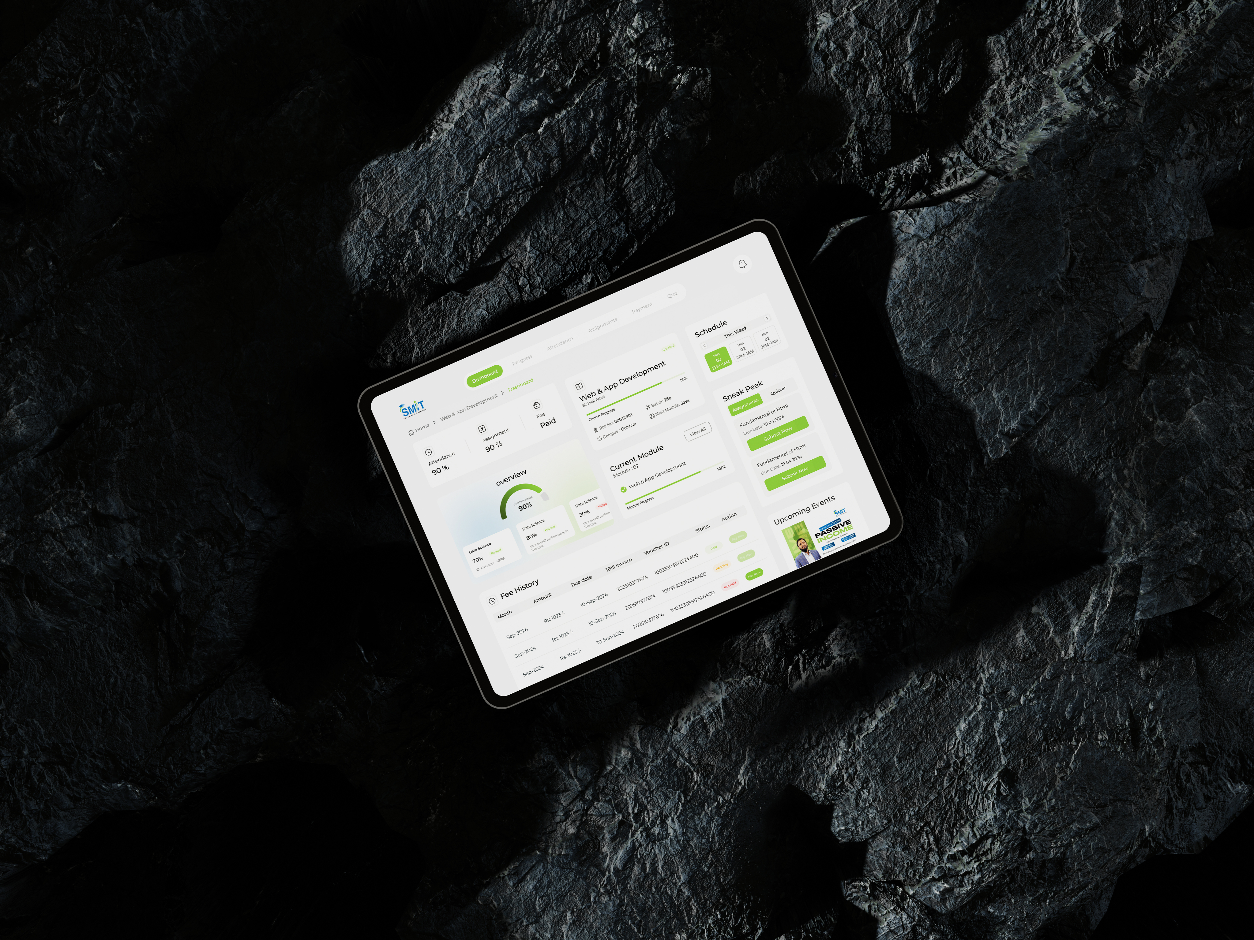
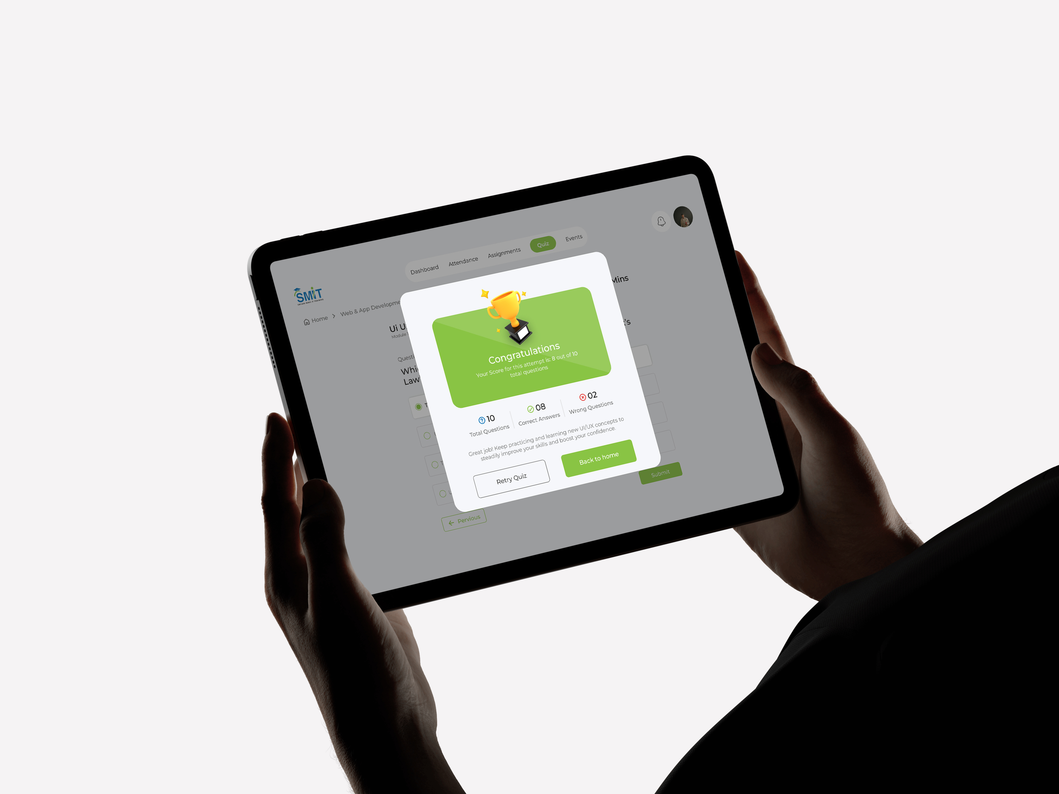
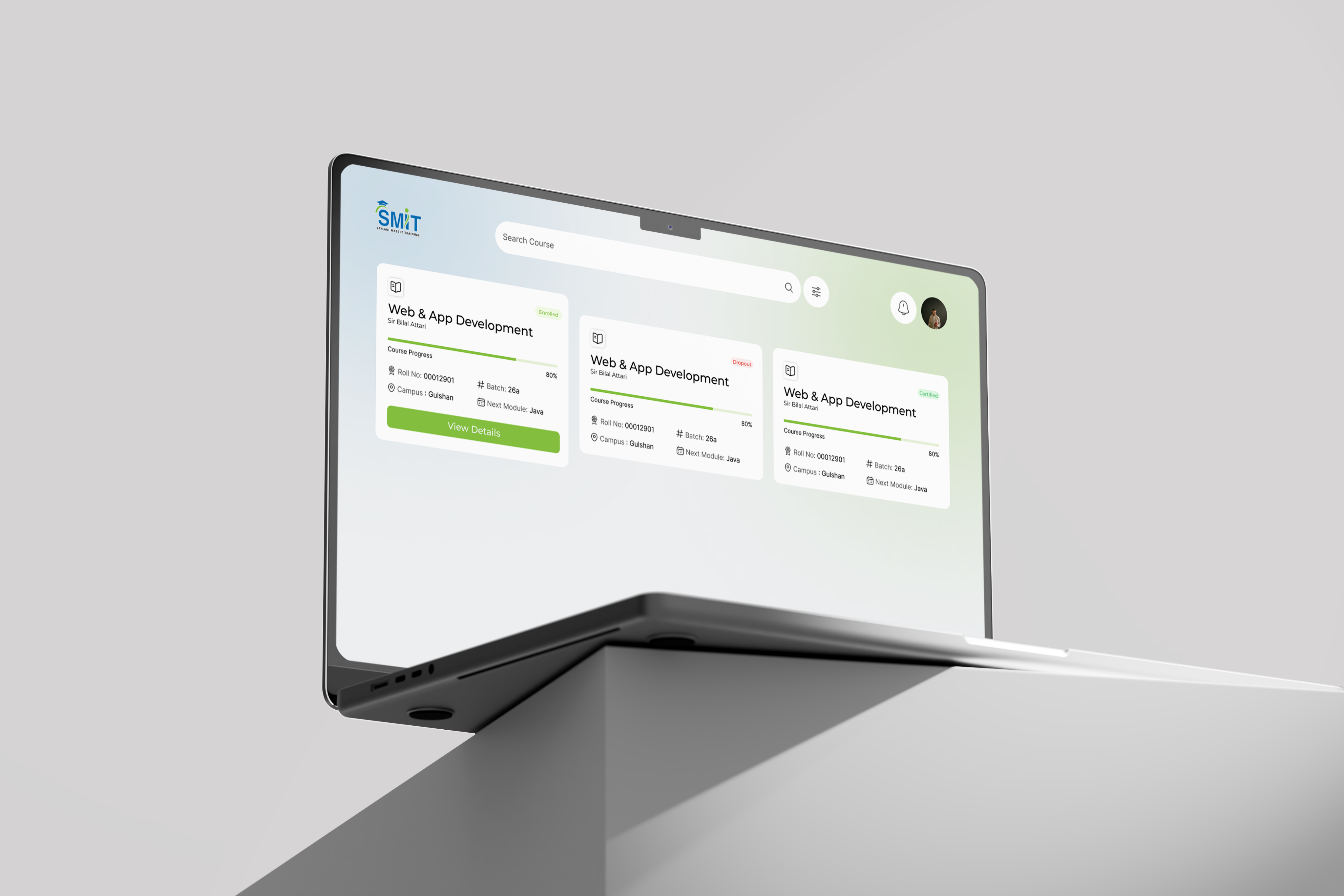
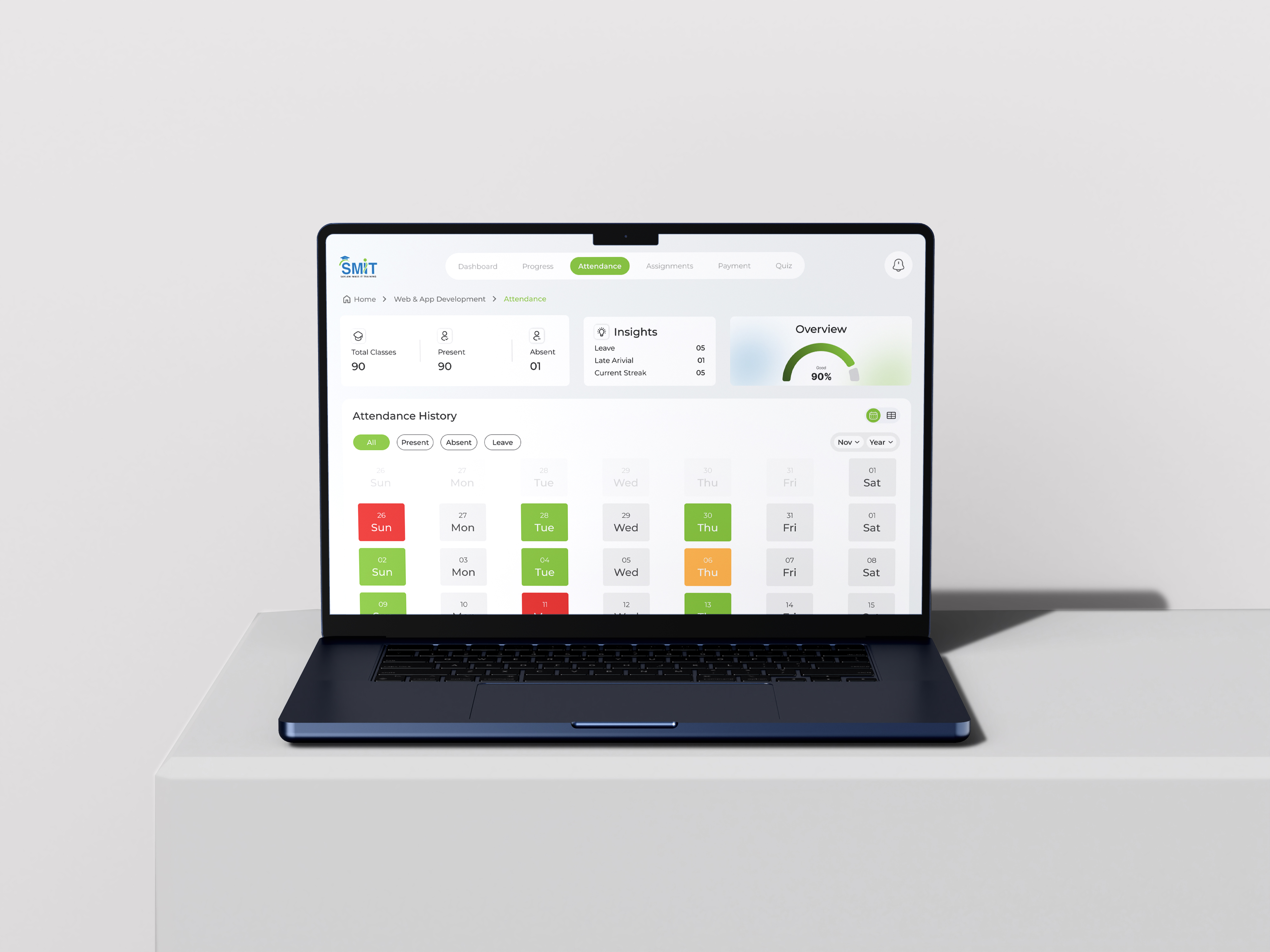
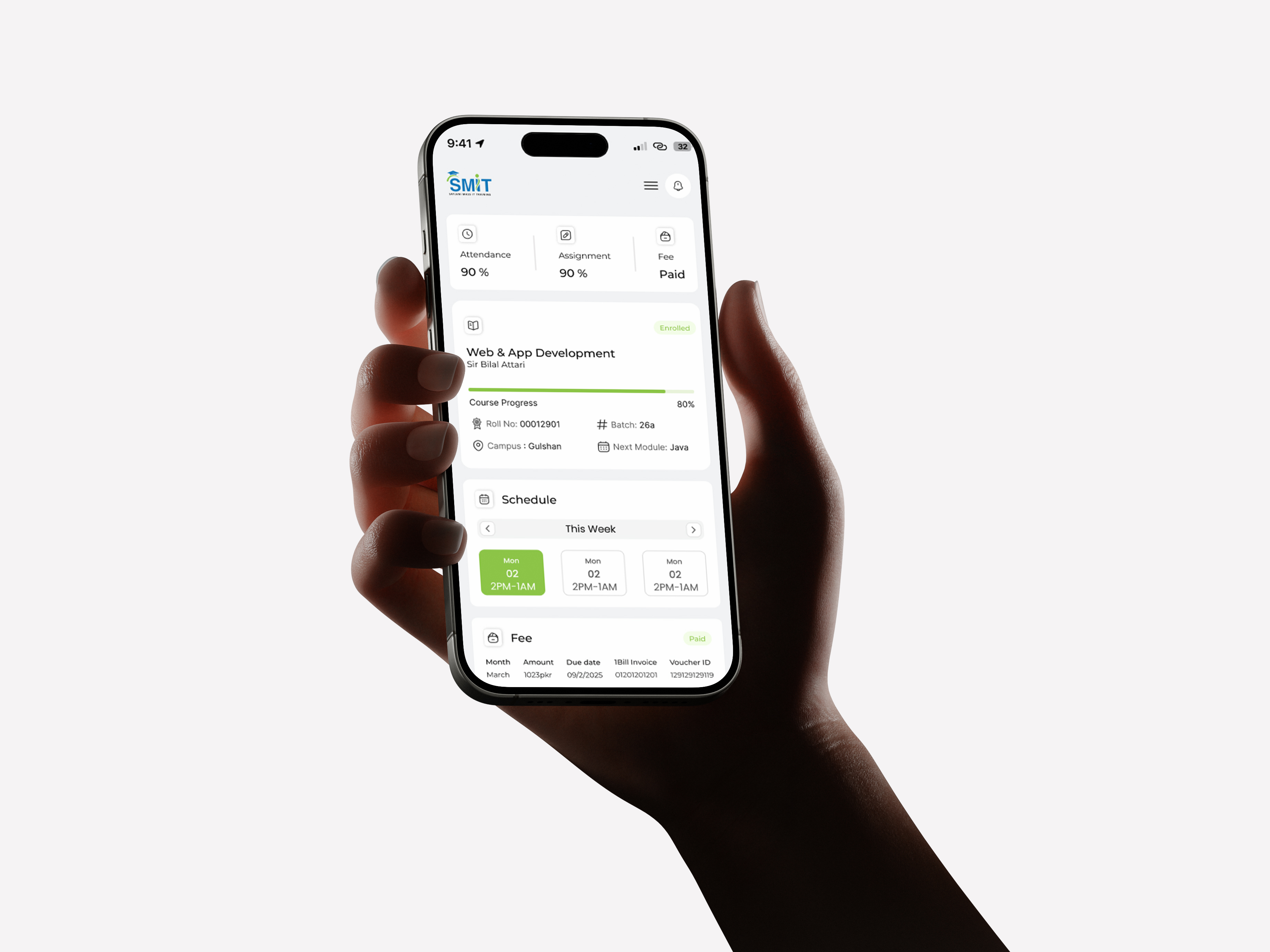
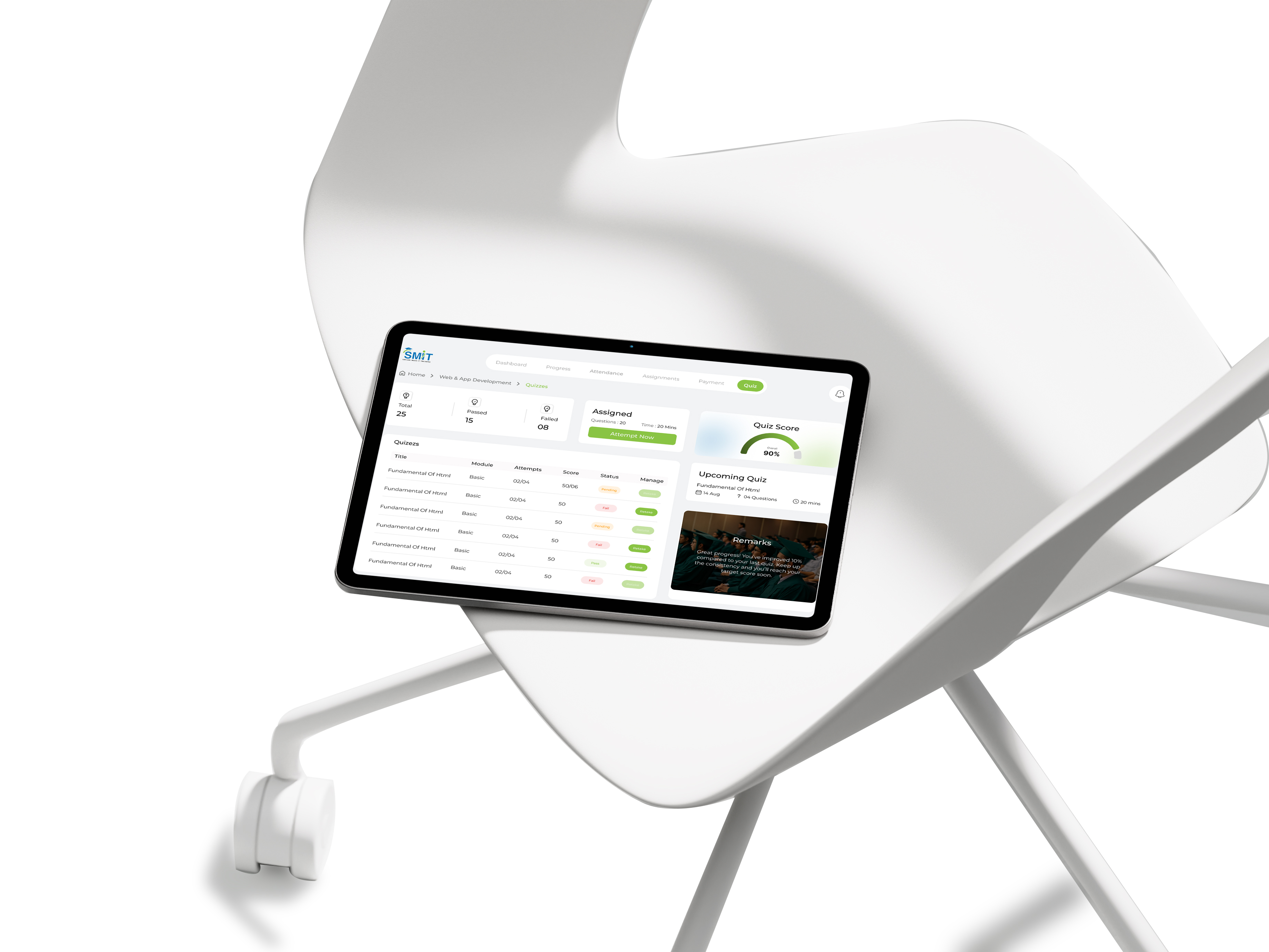
The goal of the redesign was to transform the platform into a structured and intuitive system where users could easily navigate between tasks, access important information quickly, and complete actions without unnecessary friction.

Rana Zaeem
The goal of the redesign was to transform the platform into a structured and intuitive system where users could easily navigate between tasks, access important information quickly, and complete actions without unnecessary friction.
Zaeem needs a streamlined portal to easily access course materials, check updates, and track his progress without wasting time searching.
Zaeem often feels frustrated when important sections are difficult to locate and when simple tasks require navigating through too many screens.

Sidra farooq
Sidra wants to manage his classes efficiently and communicate with students easily.
Sidra wants a clear and predictable interface where academic information is organized logically and important updates are always easy to find.
Sidra gets confused when the platform does not clearly highlight important information and when navigation does not reflect the way students naturally think.
Pain Point
Users struggled to complete simple tasks because of unclear information and inconsistent navigation.
User Case Analysis
Most users utilized only a few key features, indicating a need to simplify tasks and focus on popular actions.
User Behaviour
The primary users were students who needed quick access to course materials, updates, and progress tracking.
My Approach
I focused on understanding how students naturally move through academic tasks and identifying opportunities to reduce unnecessary steps in the workflow.
Possible Solution
Restructure the navigation system, improve content hierarchy, and introduce clearer interface patterns that guide users toward their primary actions.



Ahmed Raza
User Satisfaction
92%
success rate
Task Completion
87%
Improved hierarchy
Time Saved
45%
Compared to previous
By restructuring navigation, simplifying workflows, and improving interface clarity, the redesigned platform reduced friction and created a more efficient user experience.
Improve accessibility through better contrast, keyboard navigation support, and screen-reader friendly components to ensure the platform works for a wider range of users.
Add built-in communication tools that allow instructors to provide direct feedback on assignments and enable students to ask questions without leaving the platform.